Showing posts with label Jakub Jozefowic. Show all posts

Friday, 23 January 2015


Evaluation - Q4

During the editing process i have received two key pieces of criticism. One of those was the general lack of obvious edits and visual use of technology in the video (especially since it was partially electronic dance music), therefore i added a bounce to the screen in time with the beat of the base drum, as well as a blur effect to emphasise the drunkenness of the singer. the second piece of criticism was our lack of filming locations. therefore i removed a chunk from the bass track towards the end and we went to film at night in Finsbury Park, making the video visually alot more interesting. 


audience feedback for final outcome of video


unfortunately i was unable to film the reactions of people during the official screening in the cinema. one of the key problems was the lack of lighting. this was due to my camera on which the video seemed perfectly lit, however during the editing process it was clear the it in fact wasn't. this led to me having to increase the contrast, which in turn lowered the quality of the video. the other fault with the video is the loss of focus in places, this was also created by the camera as it was locked to autofocus during filming, meaning that a change in distance or framing lead for it to lose focus and try to compensate. 

apart from that the video was received very well and i am satisfied with the outcome. 

audience feedback of ancillary work


The main fault of the digipak was the font used on the rear side of it. while i agree it is slightly out of place i could not find another which was better, and i thought it would not be wise to use the same font as on the front since it is not easy to read.


Evaluation - Q3

Powered by emaze

Evaluation - Q2


One of the clearest examples of synergy between the products is the almost exclusive focus on the artist, we have planned this as our music genre is partly 'pop' in which it is common to create a celebrity of the lead vocalist through mainly focusing on them throughout all the products.

another aspect of synergy between the products is the artist's clothing. while it is not the same outfit is is the same 'taste' of clothing often seen at parties or generally worn by teenagers.

These products can easily be recognised as linked through the large amount of close ups in teh video, and the artists face being on every ancillery product, making the artist's recognisable face an icon in of itself. 

i believe the main and ancillery products are very successfull, however that does not mean they can not be improved. for example the lighting was slightly too weak when filming, leading to noise in dark areas.

i believe the target audience will be very attrackted to these products, mainly due to the highly relatable main singer with great taste in clothes who creates (very popular) dance music. the ancillery products are also eye catching due to their clean design and breaking of fourth wall. 

due to having created the digipak from scratch i have no existing digipaks to demonstrate design features i have borrowed from them. 


Evaluation - Q1

In what ways does your media product use, develop or challenge forms and conventions of real media products?


ancillery product - 

With the digipak i have challenged the convention of haveing a robust background, instead replacing it with a clean white background which is quite uncommon. i have however used the style quite common in 'pop' music which is to have the visuals focused primeraly on the singer.

the same pop style carries on to the inside of the digipak.


the advertisement also follows these conventions.


Formal closing of blog

i have officially finished blogging about my vdeo and ancillery product.

Completed advert


Completed digipak 


Monday, 12 January 2015


Digipak - The inside


This cover was very simple (perhaps too simple) however there is nothing i could add or replace in order to improve it as any change would either look unprofessional or break the aesthetic of the digipak. however i still think this is a satisfactory inside of a digipak as it has a strong and large image of the artist looking friendly and welcoming which is nice and relates to the personality we have created for the artist which is a generally nice and friendly guy.

Digipak -  Final cover


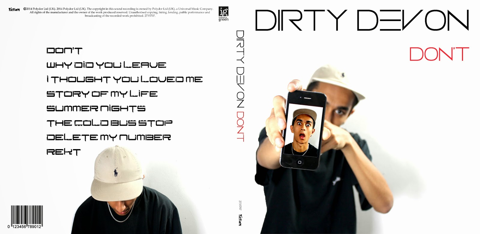
Here is the finished front side of the product. i have added things such as copy right disclaimers and industry logos.

I have changed the name of the album to the name of the single i have created the music video for, as well as make the front image of the artist larger.

Overall i am very pleased with the outcome of this product and will now move on to create the inside of the digipak. 

Digipak - Improving on Criticism #2


Positives - 
  • looks impressive and clean from all distances
  • portrays the singer and his image very well
  • incorporates technology and trendy products such as the iPhone
negatives - 
  • album title is cheesy
  • the image on the front is too small
  • lacking product markings and logos

Digipak -  second design


This is a big improvement on my previous cover. It is alot cleaner visually while still being interesting. 

another improvement is the font on the front. It furthermore highlights the sleek, minimalistic theme while also looking modern and stylish.

One negative thing which can be said about it is the font on the rear side of the digipak could be improved, however i could not find a substitute for the font which continued the modern and minimalistic aesthetic. 

Digipak - improving on criticisms 

The only way to eliminate the flaws from my initial design is to make it sub par and uninteresting, therefore i have decided to start from scratch and create a completely new cover while keeping in mind the previous criticisms.

Digipak - Comments


Positives -
  • very strong background image
  • striking contrast of colours 
  • well framed
Negatives - 
  • the font in unprofessional and hard to read
  • hat resembles one of a Mc Donald's employee 
  • image of artist is over edited, meaning it is hard to see and remember his face
  • cover is very busy and would be hard to recognise on a shelf along other CD's 

Digipak - First draft


This is my first idea for my digipak.  It uses a mid shot image of the artist in an interesting position with the colour levels adjusted on his skin, giving it a platinum look. 

The artist is also pointing to his hat which has been coloured red (to create a clear theme of colour on the cover, i did the same with the frame that the artist is holding, colouring it white.)

For the background i used a very grimy and urban image of a building in black and white. this (due to being monochrome) does not draw attention away from the image of the artist or the text.

As for the text i have chosen an urban looking font, this is due to the letters being a minimalistic and unusual shape, and being stylised to look like being created by stencils. 
 Digipak - Ideas

For the digipak and advert i have an idea to focus mainly on the artist and his hat in order to create a strong artist artist image, this will mean mid shot images where you can clearly see his face and outfit. 

Furthermore i will try to relate the images and graphics present on the cover with the style of music (which is partly electronic) meaning i would like to use filters and effects on the photos. 

In terms of aesthetics the music video was exclusively urban so i will try to incorporate this theme into my digipak.

Wednesday, 10 December 2014


Planning ancillary work - location


For the background of our images we have chosen a blank white wall as this combined with the framing (torso only) means we could replace the background with almost any image in Photoshop.

planning ancillary product - inspiration

Due to my experience with Photoshop and product design i have decided to create a product from scratch in terms of ideas for digital images included in my digipak and advert instead of finding an existing one and attempting to imitate it. Through trail and error as well as feedback i will see what kinds of compositions work aesthetically and which do not, and through this process create a final product.


Planning ancillary product - photos

These images are really well suited for use in a digipak or advert due to their very high quality as a result of good lighting, a high resolution dslr camera and a well focused lens, also the plain background makes them easily editable.

 Due to framing of the images there's a good balance between the visibility of the artists face and the visibility of what he is wearing.

 The images also include the artist's iconic hat in every shot, which is vital for the product.

 The use of technology in them is very welcome as the target audience of the genre is young people who consider technology part of their culture

The use of props makes the images more interesting visually


planning ancillary work - dos and don'ts

do - 
  • use two easily legible fonts which compliment each other
  • use no more than three colours (unless necessary) which also fit with your music video
  • use good quality photos
  • follow the rule of thirds
  • make sure to include standard digipak markings and logos (barcodes, disclaimers etc.)
don't - 

  • do not use too many effects on photos
  • do not alter the dimensions of images
  • use inappropriate or ugly fonts (comic sans)
  • place text over important things (artists face)

Planning ancillary product - design ideas

fonts -

From my research i have decided that the fonts most commonly used in the 'drum and bass' genre will work very well in my product.

colours - 

Within the video the most common colour was an urban grey, however this is not a colour that stands out visually, nor is it eye catching therefore i will slightly desaturate the images in my products and try to keep with black/white, but at the same time i will add bright, eye catching colours to make the digipak stand out on the shelf. 

layout - 

This is an advert i really liked the design of due to its simplicity of layout which presents every bit of information very clearly while looking great at the same time.